Van Die Kaap Af, Jy :
a solo exhibition by Byron Mark Fredericks
at HOMME, September 16- October 2, 2022
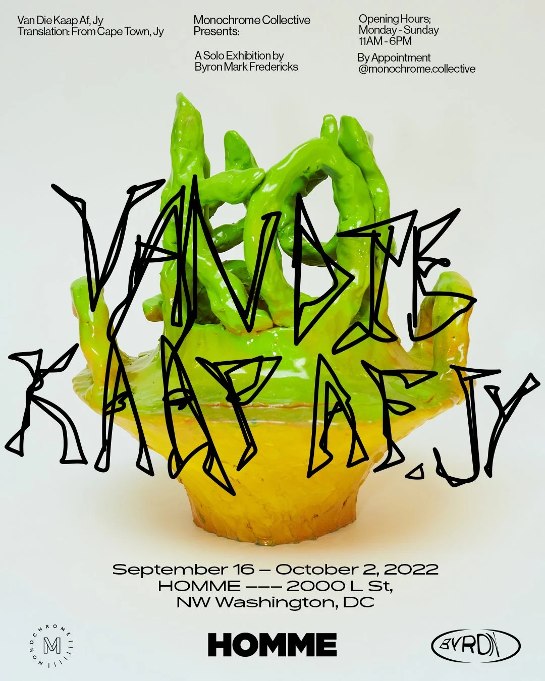
“The title of the show “Van Die Kaap Af, Jy” translates to english “From Cape Town, Jy”. This phrase is unique to cape-colored culture because of the way one phonetically recites the phrase and because of the social political identity attached to it. ”
Monochrome Collective and Homme Gallery are pleased to present Byron Mark Fredericks’ (b.1992) latest body of work, Van Die Kaap Af, Jy. Fredericks presents a body of work that consists of ceramic objects and paintings. The series of work aims to connect the dots between the meaning and the power behind language. The title of the show “Van Die Kaap Af, Jy” translates to english “From Cape Town, Jy”. This phrase is unique to cape-colored culture because of the way one phonetically recites the phrase and because of the social political identity attached to it. The phrase doesn’t work in English and loses its value and meaning. This is the area that Fredericks explores and draws his attention on.
Fredericks explores the ambiguity behind cape-colored phrases such as, “Tjommie”, “Dikbek” and “Toppie”. Fredericks is intrigued by the improvisation and creation of these phrases and their existence. This is where he centralizes his focus around the celebration of why cape-colored culture is unique to the visual landscape of South Africa.
Fredericks uses the power of language to depict how emblematic cape-colored culture is amongst the other vast cultures in South Africa. He recalls hearing these phrases from a distance, used by friends and family where one can immediately identify with that person or feel a sense of cultural resemblance. The words themself are gibberish and are made up for the most part, but they have intrinsic meaning. This is where Fredericks finds himself deshelling the inherent meaning and questioning the ambivalence behind these words and phrases.
He cites phrases like, “Jou Ma se, and Awe My Brul” that you will hear on the streets of Cape Town. Majority of these cape-colored slang terms are seen as vulgar and derogatory. Fredericks uses links of race, language, and class to decipher the complex history and associations with these phrases. As a colored person in South Africa, you are neither black nor white. A starting point begins with dissecting these colloquial words such as “Jassis'' or “Awe My Bru”. Both of these phrases could mean multiple things depending on the context. Fredericks breaks apart these phrases by educating the viewer on what these phrases mean in english. Often there's no direct translation as these words are inherently colloquial. His adaptation of the colloquial language and nuanced phrases provides the tooling to interpret new meanings of his background and personal identity. These words aren’t meant to be celebrated as they are frowned upon. Instead, Fredericks see’s this gesture as a token of cultural appreciation. Fredericks is using these ceramic objects to start a dialogue that asks the viewer to forget about the inherent meaning and move past the associations. This is where Fredericks blurs the lines with language and objectification. Fredericks’ ceramic objects are tokens that debunk the physical meaning of these words, but rather celebrate the energy of being a colored person.
A meaning that tells his story of the future, rather than the story of the past. Fredericks recalls when he grew up, he was confused about where he fell within the racial spectrum. “I wasn’t black enough to think of myself as African nor white enough to be European. I can resonate with the black people as much as I can with the
white people.” For the first time, Fredericks sees this as an opportunity to re-write how colored cultures are shaped and narrated. It isn’t depicted via being not black or not white or by a color. He focuses the attention on the ambition of coming together and providing an outlet to memorialize what is unique to cape-colored culture. Simply put, the celebration of a culture that deserves its own platform. Something to be proud of, instead something that is frowned upon.
Fredericks’ paintings are tongue and cheek, such as the phrases. It is meant to be evocative and inviting with chaotic energy. The works are cited by the raw automic markings, graffiti and unconscious paintings that you see on street walls around colored areas in Cape Town. Fredericks captures the disorganized chaos of gibberish writings in spray paint you see along the cement walls in Cape Town. He takes this energy and applies this to canvas in his work “Mitchells Plain” and “Moer”. Fredericks borrows these techniques you see on the street, in the way graffiti places ownership of a wall. He does this in a very juxtaposed and refined way via language and uses a phrase, “Moer” cut out of painted canvas. “Moer” is seen as a curse word in South Africa. However, it has no value to someone who has no context with it. Fredericks sees this as the sweet spot. In his paintings he uses reference points of language, graphic design, clothing and specific geo locations within Cape Town to highlight the aesthetic of the cape-colored culture. Fredericks is interested in the rawness and underlining beauty of how markings and colors that don’t make sense at all can interact with each other and fit together seamlessly. A romantic metaphor for how culture can be created and work harmoniously together.
With this series of works, Fredericks aims to provide a new way to see things by giving it a new context. An attempt to open up a holistic conversation that keeps cultural moments moving forward regardless of historical backgrounds. To mark this cultural sphere is why these objects and works exist. The ceramic objects are heirloom tokens of culture. A cemented archeological souvenir of cape-colored culture with new added context. He celebrates his culture as it is a part of his identity and opens a dialogue for future generations.
UMBRELLA : group exhibition and full city block art activation November 11-14, 2021


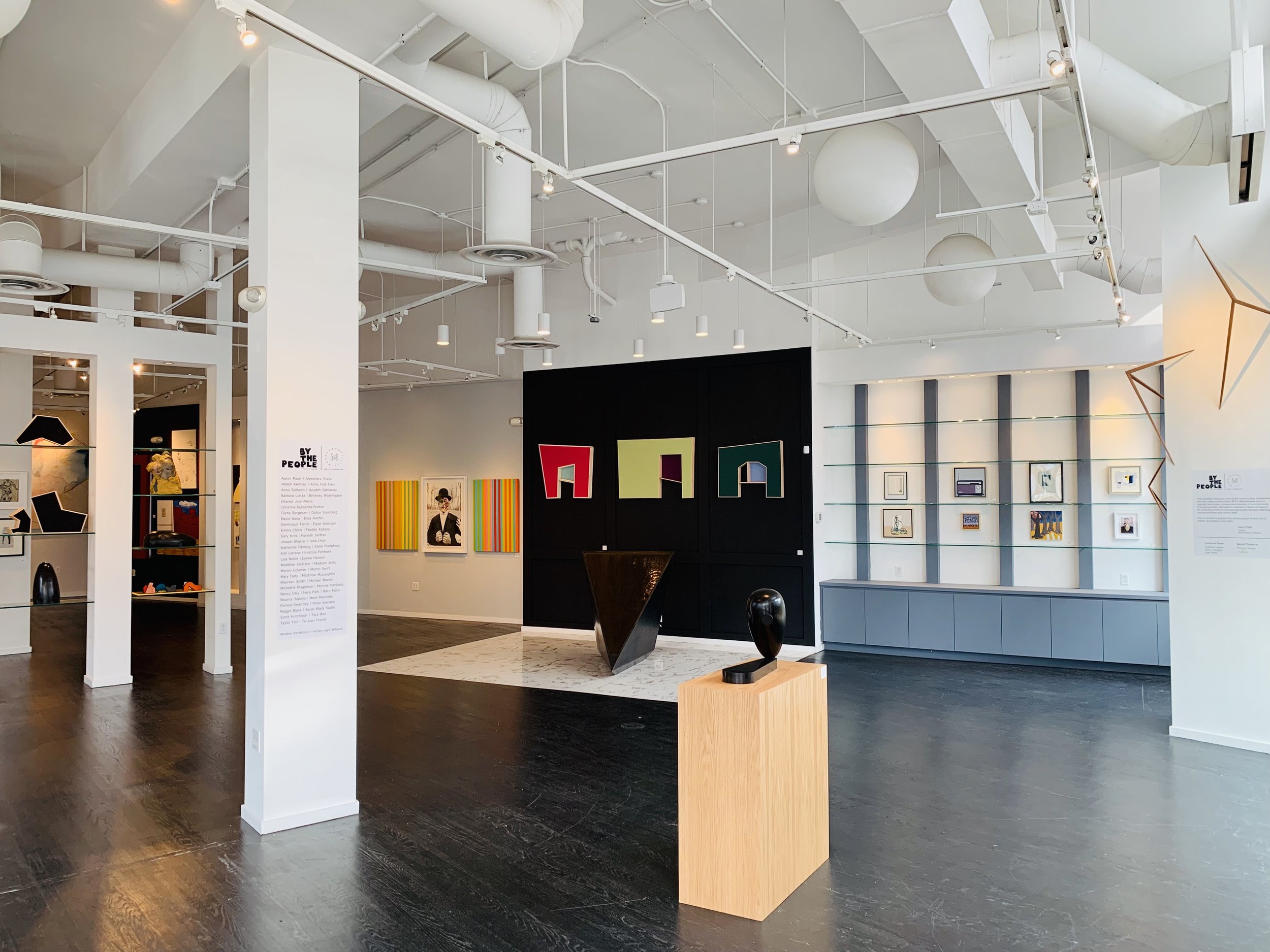
BTP x MONOCHROME: Fine Art Fair Featuring DC Artists
June 8 - 23, 2019


Curated by Nina O’Neil, this exhibition features some of the most exciting established and still-undiscovered artists. BTP x Monochrome aims to highlight the artistic richness and diversity of our community of working artists. We hope to cultivate a culture of support for practicing artists and encourage locally-focused collecting among residents and visitors alike.
We are thrilled to announce the 51 DMV artists participating in the art fair:
Dina Anchin, Nicanor Aquino, Alexandra Arata, Tara Barr, Curtis Bergesen, Reggie Black, Madison Bolls, Michael Booker, Emma Childs, Julia Chon, Marion Colomer, Nancy Daly, Mary Early, Dominique Fierro, Katherine Fleming, Anna Fine Foer, Taylor Fox, Tejuan Friend, Pamela Gwaltney, Lynne Hanson, Elyse Harrison, Scott Hutchison, David Ibata, Peter Ibenana, Monroe Isenberg, Charles Jean-Pierre, Freddy Katana, Allison Keilman, Micheline Klagsbrun, Gary Kret, Barbara Liotta, Kim Llerena, Nora Maccoby, Aaron Maier, Nate Mann, Matthew McLaughlin, Lisa Noble, Nara Park, Kristina Penhoet, Katie Pumphrey, Christine Ruksenas-Burton, Hannah Sarfraz, Sarah Black Sadler, Azadeh Sahraeian, Anna Sellheim, Joseph Shetler, Maureen Smith, Dafna Steinberg, Madeline Stratton, Martin Swift, and Brittney Washington
A special thank you to the selection panel who, along with curator Nina O’Neil, reviewed each application to curate this exciting group of artists:
Svetlana Legetic
Henry Thaggert
Julie Wolfe
Reggie Black: ANTIgradient
April 12 - 14, 2019
This exhibition was included in UMBRELLA, a three day pop-up from organized by No Kings Collective in partnership with Collection 14. Activating the former Martha’s Table, Outfitters, and Smuckers Farms locations on 14th St, UMBRELLA featured curation and art by Kelly Towles, Naturel, Maggie O’Neill, Monochrome Collective, Girlaaa, Mark Kelner, Zachary Paul Levine, Fabiola R. Delgado, PAKKE, Rock Creek Social Club, District Dodger, and JAB.

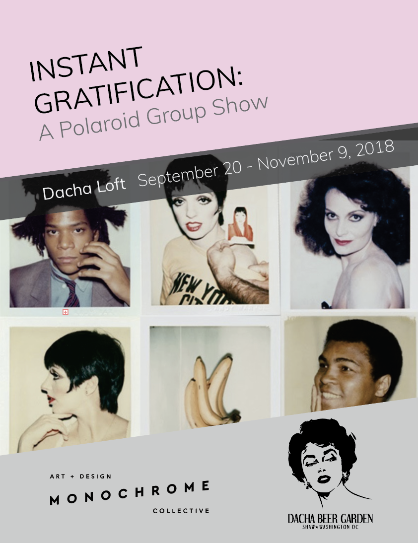
Instant Gratification
September 20 - November 9, 2019
Dacha Loft, 1600 7th St NW, Washington, DC


Illustrated in Ink
Wingchow - Jim Louden - Martin Swift - Mike Tanoory - Golden Rabbit Silent Monkey
Dacha Loft, 1600 7th St NW, Washington, DC


Framing Feminism
Kate Warren - Megan Coyle - Kate Headley - Rose Jaffe
April 5th – May 20th, 2018
Dacha Loft, 1600 7th St NW, Washington, DC

Megan Coyle

Kate Headley

Kate Warren

Rose Jaffe
Lisa Noble at The Lemon Collective
February 2018
The Lemon Collective, 810 Upshur Street N, Washington, DC

Portrait ©Max Hirshfeld

photo by Kate Warren
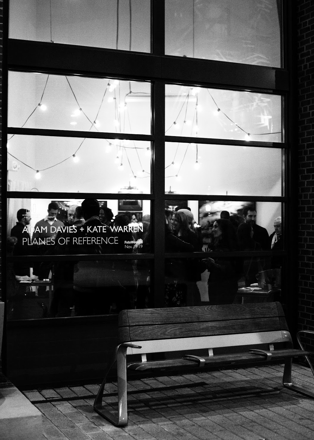
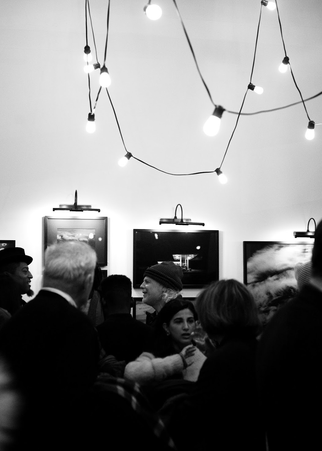
ADAM DAVIES + KATE WARREN | PLANES OF REFERENCE
November 1 - 19, 2017
A Creative DC: Brookland 716 Monroe Street NE, Studio #8, WDC 20017
Part of FotoWeekDC 2017